
What is the Best Color for Your Home?
When it comes to color, the line between bold—and distracting—is often in the eye of the beholder. A cheerful bright yellow might look great on the paint swatch, but could end up just giving you a headache in a few months’ time. Even a “safe” neutral could just appear drab if your color choices aren’t part of a larger design plan.
To make sure you don’t end up with a case of serious color regret, here are tips from three experts on how to choose the best colors for your home.

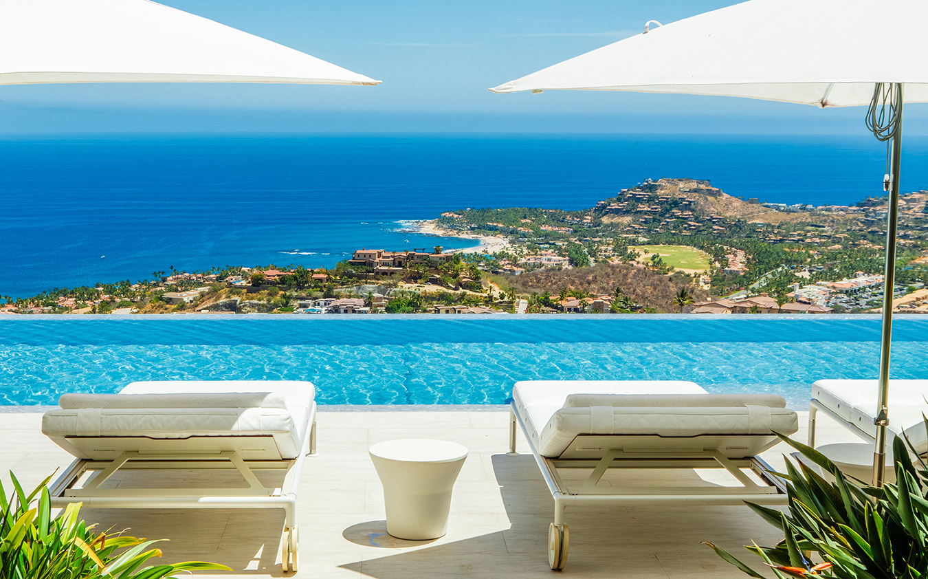
Modern at the Point, Sag Harbor, NY
Go easy on the Greenery
For color forecaster Doty Horn, Pantone’s choice for its 2017 Color of the Year—a herbaceous hue known as Greenery—came as no surprise. “I’ve been tracking the green color family in its entirety for three years,” she says, adding that it was the dominant color direction for furniture at Salone del Mobile last year.
Such a vibrant shade is best used in moderation, according to New York City-based interior designer Drew McGukin. “There’s a boldness to this particular hue,” McGukin says. “I love the idea of greenery as an accent bringing forward a warmth and happiness.”

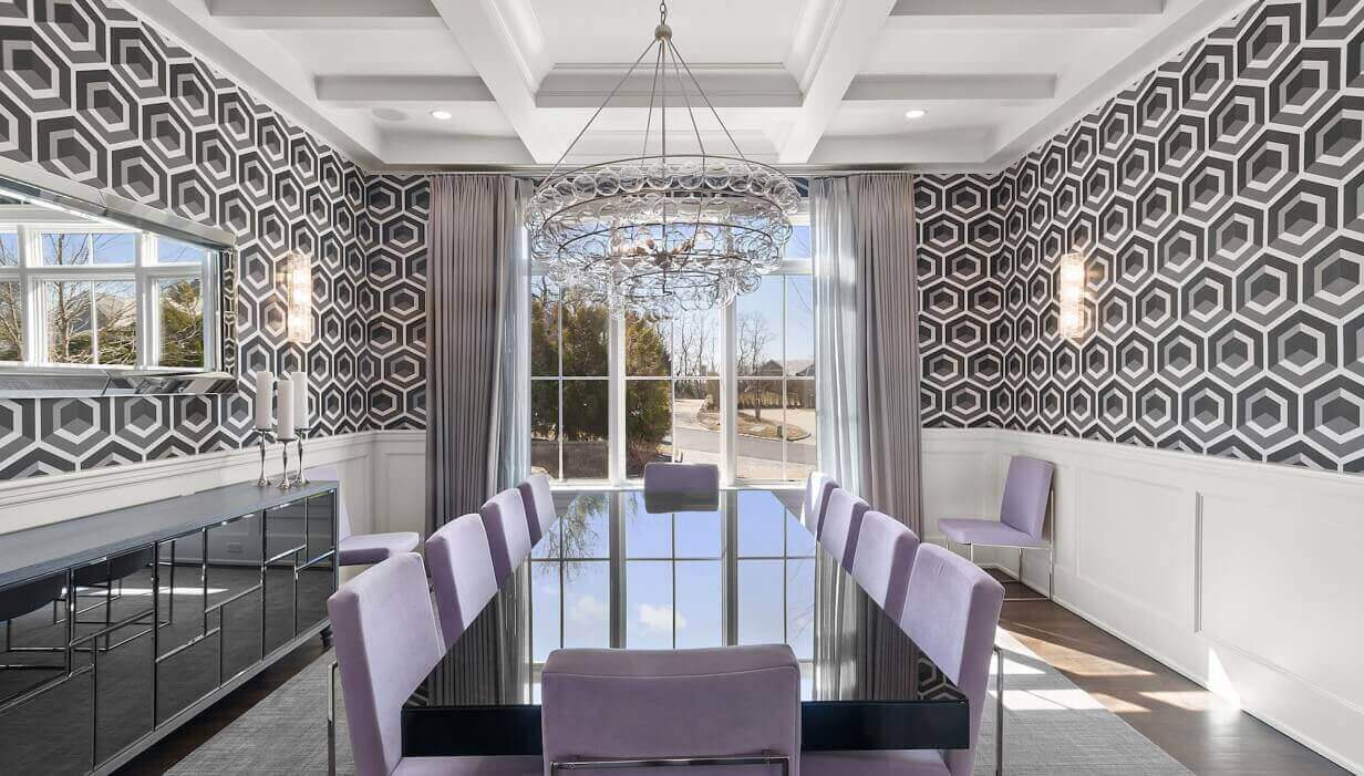
505 West 19th Street, Chelsea, Manhattan
Gray still has its fans
Gray will continue to find favor as a key neutral, but don’t be afraid to mix things by introducing some texture via Venetian plaster or lacquer. “I think we’re still in a gray mood when it comes to wall color,” says Jenny Wolf, a New York City-based interior designer.
For those looking to add some warmth to gray, consider “shades of taupe” or “greige”—a mix of gray and beige, Horn says.

40 Mercer Street #5, Soho, Manhattan
Bring in the blues
If you’re tentative about a verdant palette but would still like to imbue some color to your home, opt for a shade of blue. Calming nautical tones are taking precedence over earthier browns, as part of a larger trend of lighter tones for wood finishes and furnishings, says McGukin
For a modern take on traditional blue and white pairing, Wolf suggests adding a touch of pink. “I love the combination of blush tones with dark blues,” she says. “Blush is the new neutral.”

750 South Country Road, Palm Beach, FL
Be adventurous in the kitchen and bath
While grays and whites still dominate as the choice for kitchens and bathrooms, there’s room for a bit of fun. “I love a little color in the bathroom, whether it’s in a wallpaper or paint—I feel like there are no rules these days,” Wolf says. “I’m really excited to see kitchens in shades of blue and green.”
But even if you are going for some color, there’s one area where McGukin says you should stay relatively conservative. “Color in bathroom tile becomes dated very quickly. In a bathroom, go classic and neutral on tile, splash walls and cabinetry—the things you can swap out more easily.”