Choosing the Right Paint Colors to Help Sell Your Home

Veteran Corcoran agent Lesley Semmelhack shares smart ways to make paint work for you when it comes time to sell.
Whether you’re getting ready to sell your home—or are looking for a re-set—paint can transform a space. But the seemingly endless options can be paralyzing amid the real concern that one person’s bold choice could be another’s deal-breaker.
“The majority of my work is done before the listing even hits the market, and color is a huge part of that,” says Corcoran associate broker Lesley Semmelhack.
In addition to staging, Semmelhack frequently repaints. Freshly painted walls in the right hues can be as impactful as a kitchen renovation, but at only a fraction of the price. Here are five essential tips on figuring out what color is right for your home:
Build on Your Color Palette
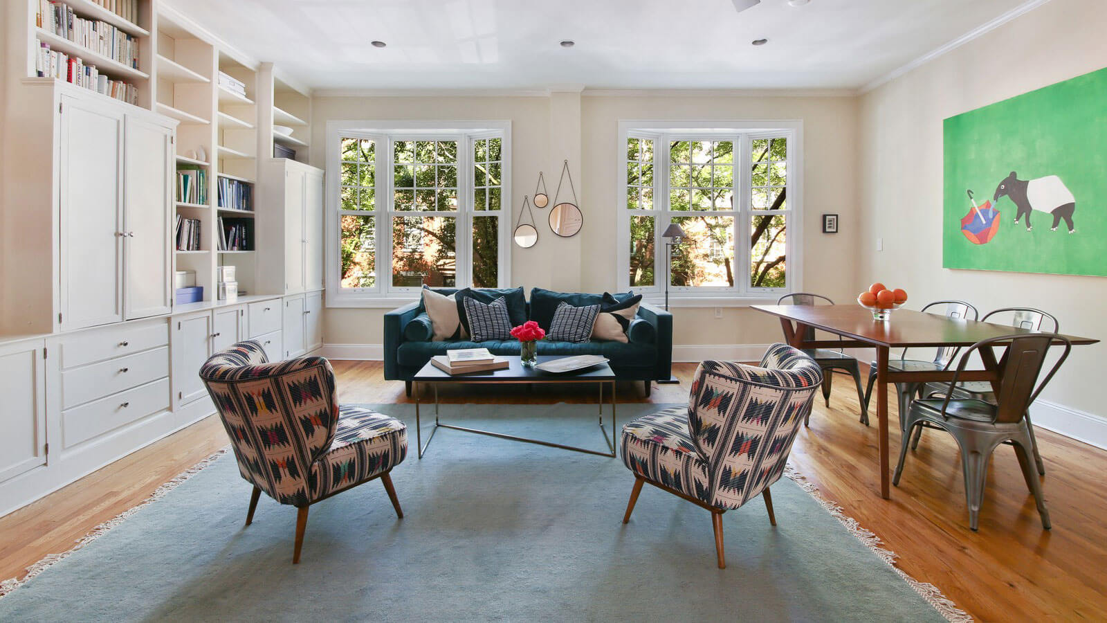
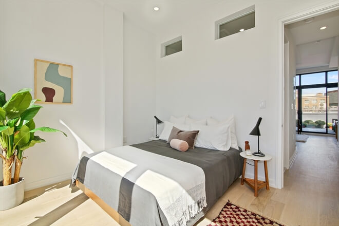
Instead of heading right to the paint chip display, Semmelhack suggests thinking about the colors already present in the space. “It’s all about creating balance between warm and cool,” she says, “If somebody has very orange-y wooden floors and vanilla walls, it reads as shabby. I might recommend that they paint their walls a cooler shade of white to compliment the warmth of the floor.” In her own apartment, recently renovated, Semmelhack complimented the bleached wood floors with a warmer off-white, Benjamin Moore’s White Wisp.
Read the Natural Light
“When I have a north facing apartment, I don’t do a shade of white that’s very cold,” she says. “The warmth of the sun isn’t going to warm that white up. With a southern exposure and a lot of light, you can go much cooler in tone.” In the past few years, grey has become a popular interior color, but Semmelhack warns that its cool tones may seem too sterile in a space without much natural light.
Use Different Shades of White
Semmelhack recently took on a brownstone itching for fresh paint. Each room was a wildly different color, and everything clashed. She decided to paint the interior white, but not just one shade—a series of different whites. “The apartment is so old and layered with history that the freshness of white is going to look really good with the prewar details,” she says. Her most used white is Benjamin Moore’s Chantilly Lace. “But not every wall has to be white, all you’re looking for is some consistency from room to room,” Semmelhack explains. For rich, historical colors, she recommend Farrow and Ball.
Try Color for Contrast
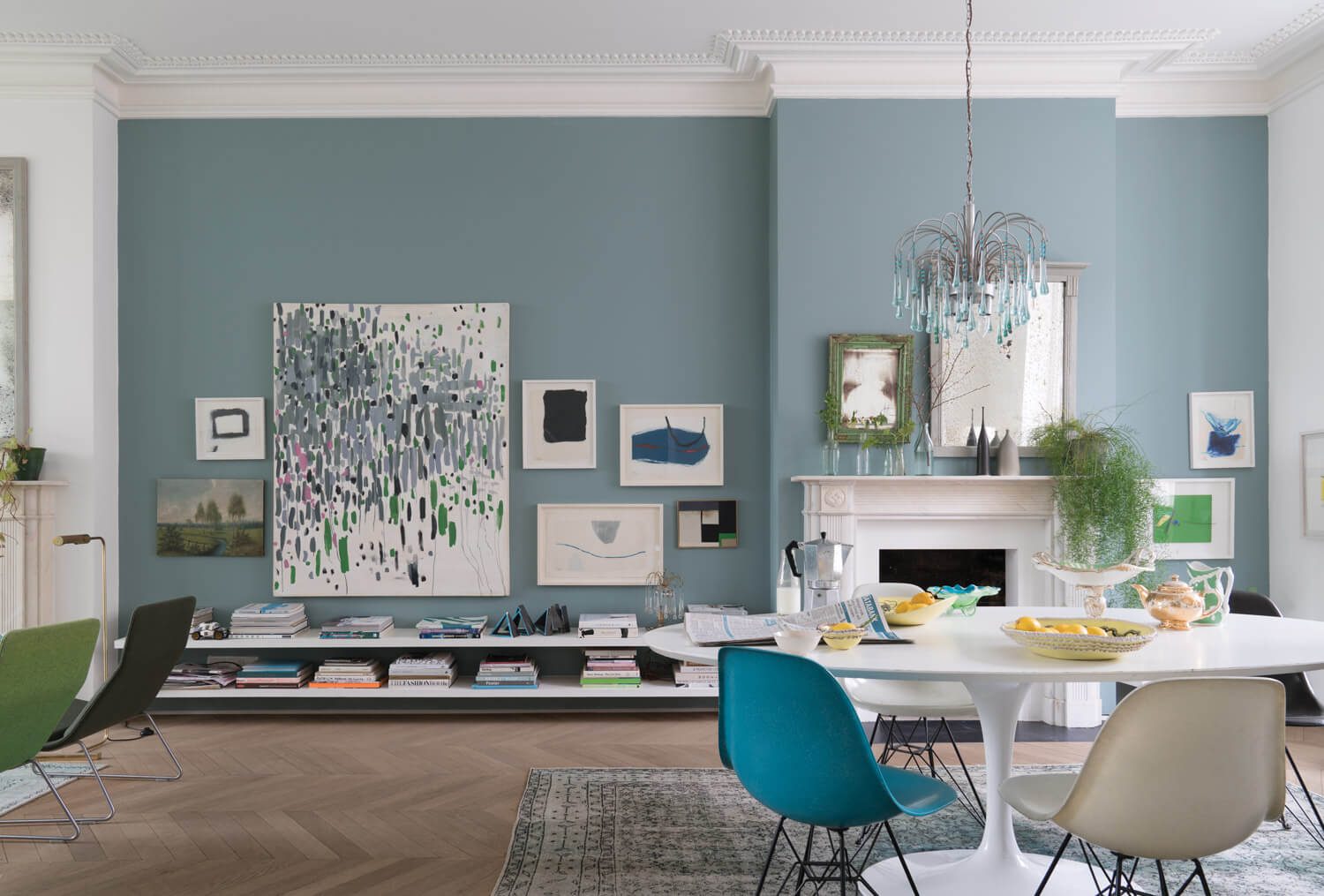
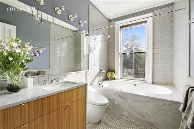
As an agent, Semmelhack gets especially high traffic on her listing photos. Considering how spaces will photograph definitely helps. She uses color to add in contrast. Benjamin Moore’s Edgecomb Gray, for example, is great on molding. If a bannister is original wood finish, black paint helps it pop. Entryways and bathrooms are a great place to add rich tones.
Keep the Lime in the Fridge
“Red and yellow are really hard to get right, so steer clear,” she says. “Also, please don’t paint a room lime green. I can’t tell you how many times I’ve seen that.”


