Embracing the ‘Fifth Wall’ in Your Home

Ceilings, too, should get the royal treatment.
When decorating your home, don’t forget about the fifth wall — better known as the ceiling. An essential part of any room, the ceiling is arguably just as important as its floor-up counterparts. Ignore the ceiling, and you’re missing out on a prime opportunity to create a more unique space.
Manhattan-based architect, Lauren Rubin, of Lauren Rubin Architecture, shares her insights on why the fifth wall doesn’t get nearly enough play and the methods she uses to “zhoosh up” her clients’ staid ceilings — from making short spaces seem taller to adding depth to any space.
Why the ‘Fifth Wall’ Doesn’t Get Enough Respect
“Most people are scared of the ceiling because in some cases, such as wallpapering and adding architectural details, the changes are more permanent than a simple paint job,” Rubin says. “It’s just much easier to remain conservative with your choices and people just fall into that.”
Where Rubin sees a plain white ceiling, she also sees countless opportunities to make a space sing — especially in children’s nurseries, bedrooms, and playrooms. Parents are usually more open to relegating bold color and pattern to those spaces, initially. She first started her love affair with decorated ceilings by painting the ceilings of all-white kids’ rooms in bold colors.
“I prefer more interesting, whimsical spaces,” Rubin explains, “and kids’ rooms are perfect places to have fun.”
Start Small with Your Ceiling Treatment
In addition to kids’ rooms, smaller spaces like foyers and laundry rooms can be the perfect places to add a surprising pattern, detail or color to the ceiling. Since you and your houseguests won’t spend time lingering in those spaces, Rubin says, “One should be wowed upon walking in.” Their vibrancy won’t seem overpowering because presumably, they’re pass-through spaces.
“Painting a ceiling is really no big deal,” she says. “If you grow out of love with the color, you can simply repaint.” If you’re still reluctant to take the ceiling color plunge, try the half-and-half approach — a mixture of 50 percent wall paint to 50 percent white (or off-white) paint to the ceiling.
“You don’t want to go too subtle with the ceiling color,” she says. “If you do, the ceiling won’t look white and it won’t accurately resemble the walls.”

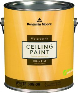
Ceiling paint — like Benjamin Moore’s excellent Waterborne ($47/gal) — has a higher viscosity than regular interior latex formulations, so painting over your head produces fewer drips and less “paint mist.”
Let the Architecture Be Your Guide
Rubin never adds ceiling details that aren’t meant to be there. “Be true to your home’s locale and its history,” she says. Ceiling medallions, coffers, wood beams, coved and crown moldings and plaster tracery are each indicative of prewar styles. Sure, tin ceilings look just right in a 1900s Irish pub, but in a postwar residence, they probably don’t make sense. In prewar homes, ornate and coved moldings look superb while at once, architecturally accurate.
In postwar homes, strategic decorative lighting goes a long way and is also easy on the wallet. Instead of relying on the same-old recessed down lights or ceiling mounts, Rubin uses lighting with perforated shades or lights that cast interesting shadows onto the ceiling. “It’s also especially useful when clients may not have the budget to paper or professionally paint a ceiling,” she says. By pouring light onto low ceilings, you can visually raise a ceiling’s perceived height.
Transform a Ceiling — and the Space Will Follow
Here are some general dos and don’ts:
- When walls are painted in neutral or lighter shades, add wallpaper to a ceiling. “Clients don’t feel as overwhelmed as they do whenever I suggest wallpapering all four walls,” says Rubin.
- Different decorative techniques produce a bevy of results: Embellishing a ceiling can mask or accentuate certain details and can create depth and interest in a room where once there was none.
- For a statement ceiling, Rubin creates a pristine mirror-like finish (sans paint strokes and imperfections) on ceilings via spray-on lacquer. Although the lacquer is somewhat costly and semi-permanent (you need to sand it off if you ever want to repaint), it reflects light beautifully throughout a space. But don’t think you can achieve the same result with high-gloss or metallic paints, which will show every blemish.
- For a more subtle look, Rubin uses white or neutral wallpaper with a raised pattern to create interesting shadows and depth via its texture. Likewise, wallpaper with a small repeating print on a white background, or a background that matches the wall color, can mask issues such as small cracks and uneven surfaces, too, while adding a “zen-like quality.”
- For uneven ceilings or awkwardly shaped spaces, use the same color paint as the walls — or the same wallpaper. “It tricks the eye into not understanding where the walls stop and the ceiling begins,” explains Rubin, “so you simply won’t notice flaws like a low ceiling or irregular lines.”
- Steer clear of adorned ceilings in kitchens and bathrooms. “Kitchens should be functional,” she says. “I’m not trying to draw the eye up and I’m not trying to make a kitchen overly fun, either.”
When You Should, Shouldn’t Dance on the Ceiling
While Rubin isn’t afraid to use vibrant colors and patterns on any ceiling, she does so on a case-by-case basis, taking into account the room’s walls, millwork, the sizes of the windows and the ceilings of any adjoining spaces.
“It’s all about balance,” she says. “Decorating a ceiling is a lot like dressing up. You have to choose which body part you’d like to highlight and which one you’d like to mask.”
Don’t be too concerned about the staying power of decorate ceilings, either. “If something looks beautiful, it doesn’t have to be timeless,” she says. “Don’t worry if it has become fashionable — just enjoy it.”


