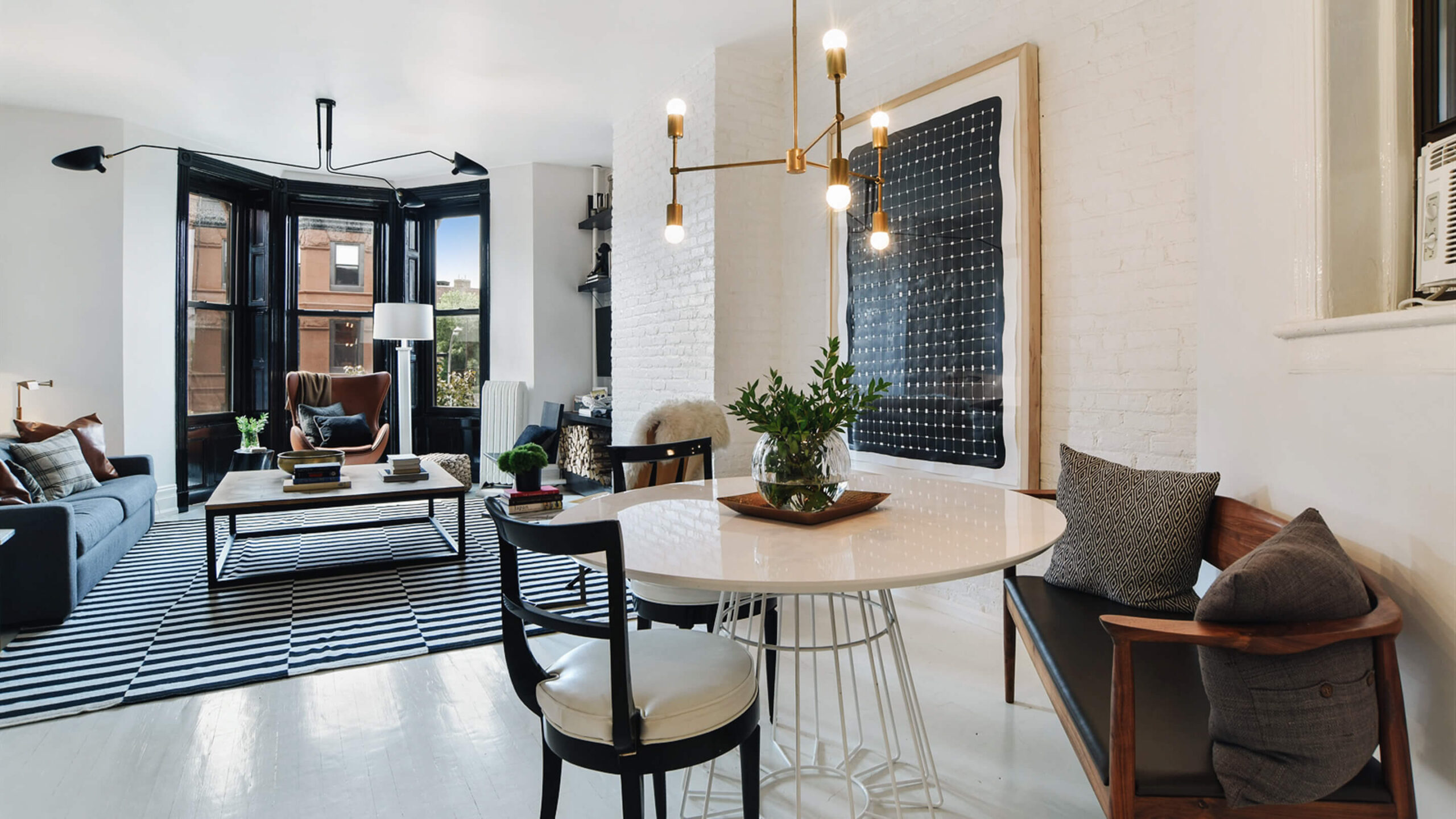
Before and After: Brooklyn Co-Op Gets Luxe Update
First time home-buyer Joe Mazias was feeling nervous about the floor in his new apartment. He’d just closed on a two-bedroom co-op unit (now under contract) in a circa 1910 brownstone in the Park Slope section of Brooklyn, and had enlisted interior designer Dan Mazzarini of BHDM to help whip it into shape. Mazias signed on to Mazzarini’s sophisticated black-and-white concept, but there was one sticking point—the designer wanted to paint the floor white.
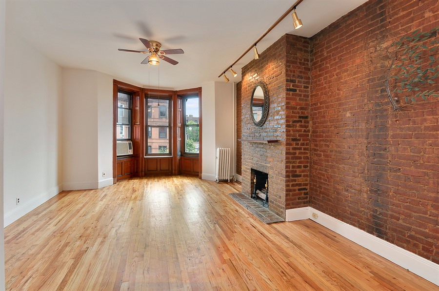
BEFORE
Three years later, Mazias couldn’t be happier with the results; the highly durable Sherwin Williams ArmorSeal Rexthane in white helped set an airy, loft-like tone for the apartment. Plus, it hasn’t scratched at all. “Paint is an affordable and highly transformative tool,” Mazzarini says. “We wanted to highlight the historical character of the apartment, while also bringing it into the 21st century.”
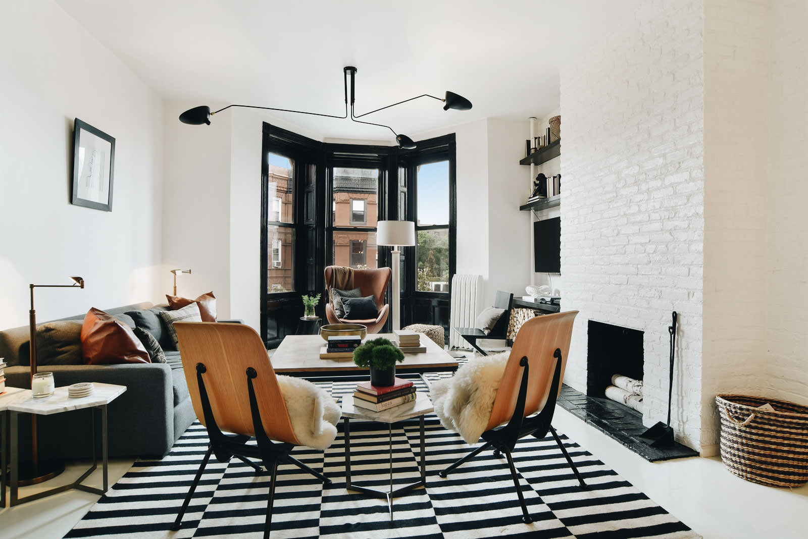
AFTER
To emphasize the living room’s bay windows, he painted the casements a historically accurate glossy black; the nearby red brick wall got coated in white. For the master bedroom, charcoal gray seemed like a natural choice. A large-scale Serge Mouille light fixture adds another hint of grandeur. “Dark colors are always a challenge for clients in the beginning,” Mazzarini says. “But the room has big windows, double exposure, and a white floor, so the dark gray gives it a richer, more considered feel.”
The use of black and white adds more drama to the second bedroom, a combination office and guest room. The bottom half of the room—pipes and window casements included—is black, the upper half is white. The room also features built in bookshelves; a cheeky poster above the daybed reads “Broke In New York City.”
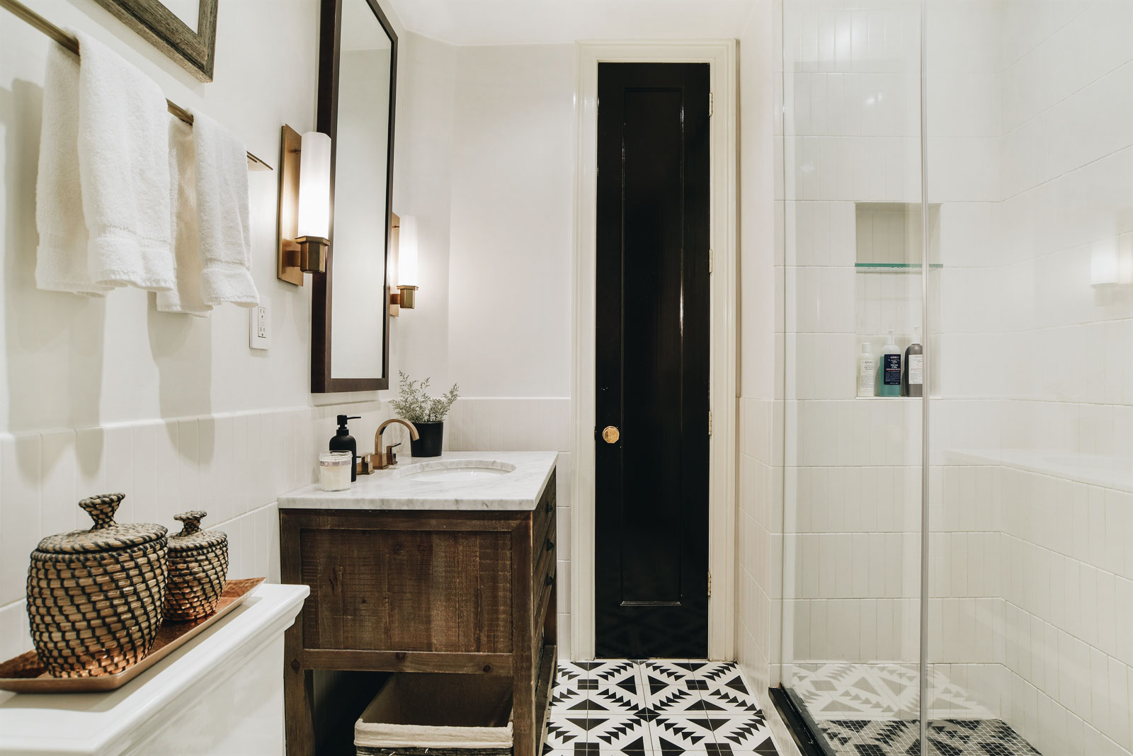
High-impact, but low-cost, paint allowed for a greater budget to update the kitchen and bathroom. For the latter, Mazzarini replaced an old (but not original) tub with a walk-in, glass-walled shower. He added a vanity from Restoration Hardware and introduced new fixtures throughout. The handmade, encaustic cement tiles on the floor feature a simple, but contemporary pattern. Because they fit into the home’s pared-down color scheme, they don’t feel out of place.
The kitchen proved more challenging. Opening up the space to the living room upped the design ante. Mazzarini wanted to create something of a jewel box: With Ikea cabinetry as the base, he added modern gold drawer pulls from New York’s oldest hardware store, Simon’s. The black honed marble countertop and herringbone-pattern backsplash came from Nemo.
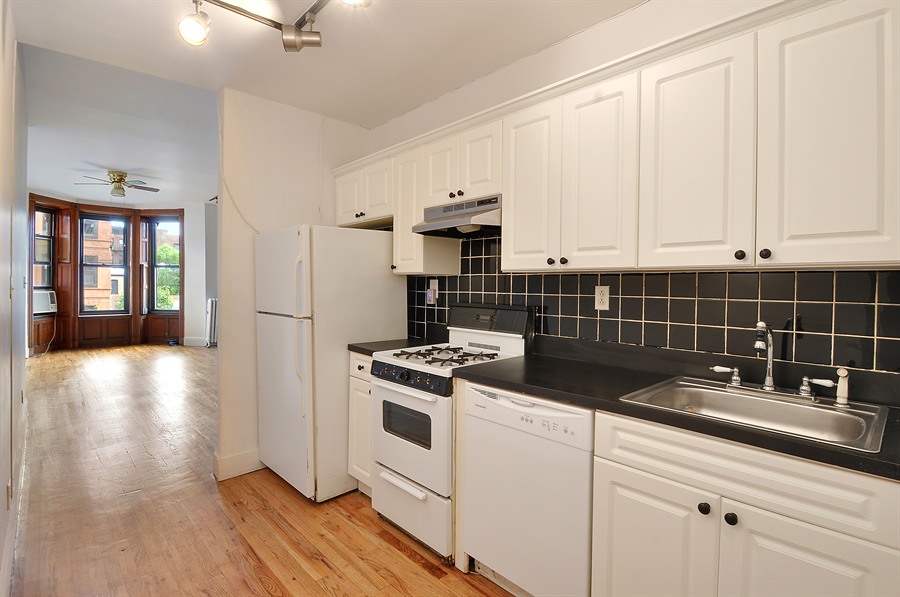
BEFORE
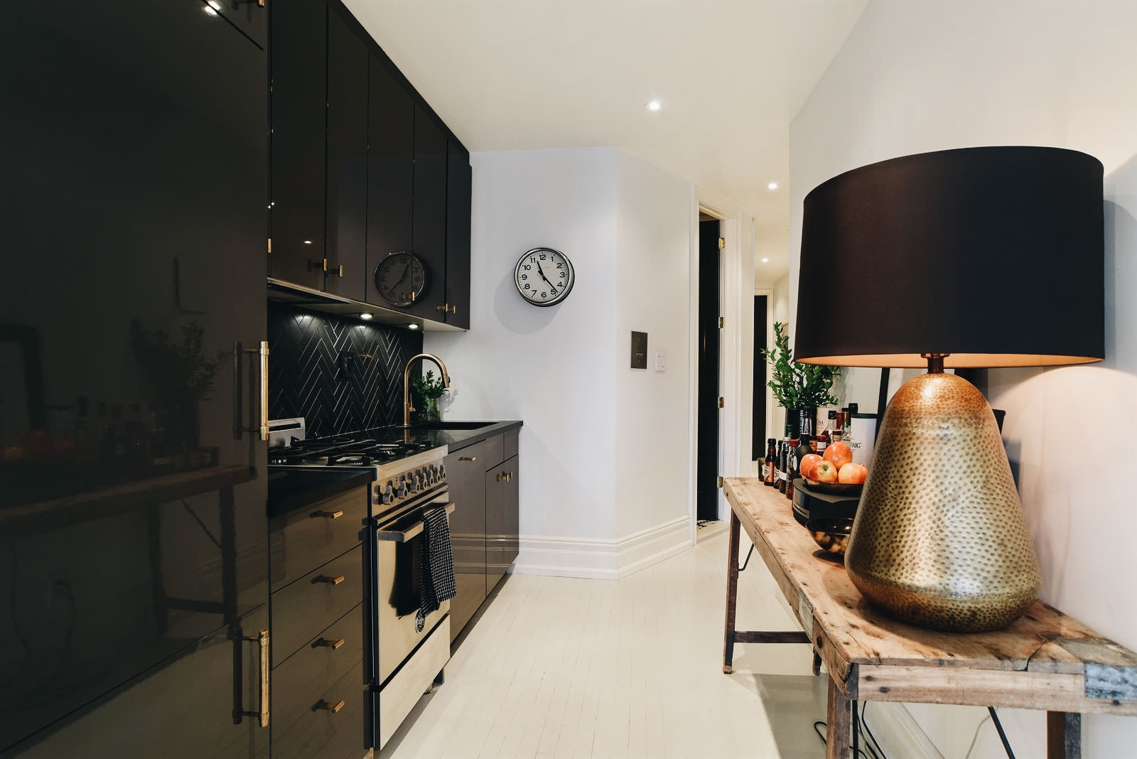
AFTER
Higher-end appliances replaced their functional, but ugly, predecessors. The Bertazzoni range stands out in its stainless glory, but the Lieber fridge and the Bosch dishwasher have panel fronts to help make the room feel less kitchen-like. A vintage wooden table across from the cabinets and appliances functions as a bar and adds a more natural, earthy feel to the otherwise minimalist space.
“I like having an open kitchen-living plan,” Mazias explains. “But the longer layout of the apartment means that when I’m sitting in the living room, I’m not staring into the kitchen, which is great.”
Another luxe touch was to replace the cobbled-together mix of (non-original) doors with custom versions set in taller frames. “It totally changed the space and gave the hallways height,” Mazias says. “I would do that again in a heartbeat.”

After two months, the makeover was complete. “When I walked into the finished apartment, it was like being on one of those makeover TV shows,” Mazias recalled. “Everything had been transformed.”
Corcoran agents Bridget Applegate and Charlie Pigott represent 749 Union Street, 3L in Park Slope.


