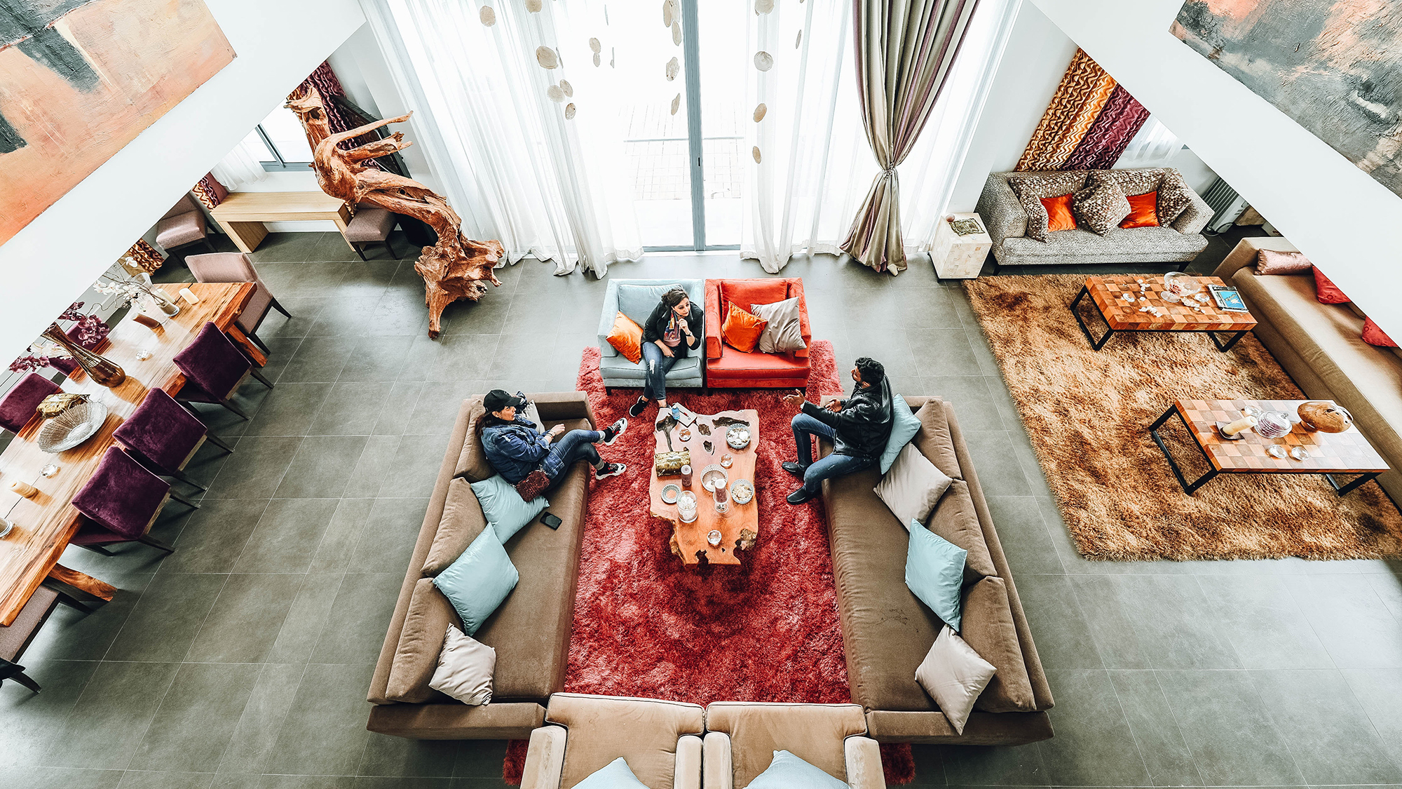
Transform Your Abode with These Japanese Interior Design Philosophies
Think of a time you sat in a space designed with a Japanese aesthetic. Chances are you felt a certain sense of calm and relaxation — with good reason. The energy of a space is one of the fundamentals of Japanese design.
According to Japanese belief, the state of our external environments directly impacts our inner selves. And nowhere is that truer than in our homes, where clutter can cause subconscious feelings of stress and disorganization.
But that doesn’t mean you have to become a devout minimalist—you can imbue your home with that same calming sense of Zen by incorporating these three Japanese design philosophies.
1. Kanso
What is it: Deriving from Zen Buddhism, kanso considers the movement of energy in a room. The more objects in a room, the harder it is for energy to flow freely, creating a hectic atmosphere. Kanso encourages us to keep only what is necessary, to allow more space for quiet moments of contemplation.
Why we love it: Translating to “simplicity,” kanso is at the heart of minimalist design because it helps us consider what we truly need in our homes. The idea is not to live in sparsely decorated spaces but to carefully consider each object that we bring into our home and whether it actually serves a purpose. (This is especially important in apartment living, where space is precious.)
How to achieve it: Consider each object in a room (or that you are considering adding to it). What is its purpose? Is it essential? Does it distract from other objects in the room? It could be that antique side table that you loved in the store but keep moving around because it doesn’t fit anywhere. Or the piles of impressive coffee table books you’ve been meaning to read eventually.
Conduct an inventory (and be honest with yourself) of each room in your house to determine what’s essential. Once the superfluous objects have been removed, you’ll likely discover the energy in your home is much more relaxed and soothing.
Need convincing to let some of your stuff go? Look to artist Hiroshi Sugimoto’s ultra-calming new Manhattan apartment for inspiration.
2. Ma
What is it: Rather than focusing on the objects themselves, this concept celebrates the intervals or negative space that exists between them. Think of it like a moment of pause between one item and another.
Why we love it: Similar to the idea of white space in art or magazine and book design, ma allows the items in a home to breathe. If you fill your home with clutter, you reduce the value of the objects because nothing in particular stands out. By emphasizing the negative space between fewer objects, each one gains more life and meaning.
How to achieve it: When you have an empty space in a room or on a wall, you typically want to fill it. Instead, focus on having fewer objects in your home, but arranging them in a way that gives them more prominence. In place of that crowded gallery wall, for example, opt for a single framed image or artwork that gives the viewer space to stop and appreciate it.
A keen observance of ma can transform small, inner-city living spaces—Taiwanese studio A Little Design mastered the concept when converting a former piano studio into an apartment in Taipei.
3. Wabi-Sabi
What is it: Wabi-sabi embraces the beauty in imperfection. Its roots lie in the Japanese tea ceremony dating to the 14th century, when Zen monk Murata Shuko took a stand against the reliance of ostentatious and expensive foreign-made objects in the traditional tea ceremony. He responded by using weathered, understated utensils in his ceremonies, believing the objects derived some of their beauty from their flaws.
Why we love it: In a world where we are often quick to dispose of anything that’s flawed or broken, wabi-sabi encourages us to see the beauty—and value—in weathered objects. From a sustainability perspective, it also empowers us to adapt and reuse materials (as long as they serve an essential purpose in the home, of course).
How to achieve it: Opt for natural materials like wood—especially unfinished or knotted woods—rugged stone, tarnished metals, ceramics with chips or hairline cracks, and wrinkled fabrics like linen. Wabi-sabi also embraces asymmetry and irregularity, such as mismatched chairs around your dining table.
For inspiration, check out Axel Vervoordt’s design for the TriBeCa Penthouse at the Greenwich Hotel.
As with most things in Japanese culture, each of these philosophies runs deep. To delve further into the intricacies of Japanese design and aesthetics, add Wabi-Sabi for Artists, Designers, Poets & Philosophers by Leonard Koren and In Praise of Shadows by Junichiro Tanizaki to your reading list.

Architect Frank Lloyd Wright was a great admirer of Japanese architecture and interior design principles, which influenced the design of his beloved Fallingwater house and its furnishings. (Photo: Pixabay)
[embed_cta url=”https://www.corcoran.com/nyc”]Find a place to live who you are.[/embed_cta]


