
The New Rules for Playing with Color in Your Home

It may seem like interior design is stalled in neutral — those ubiquitous white-washed walls, neutral furniture and accents of leather, natural wood and metal. But in perusing the rich hues splashed on the pages of design magazines and Instagram feeds, it’s clear that color hasn’t really gone away. So what does color mean for interior design today — and how can we use it?
The History of Color, Examined
Color, and the many variables associated with it, have long fascinated creative types, according to “Saturated: The Allure and Science of Color,” an exhibition running through Jan. 13 at the Cooper Hewitt, Smithsonian Design Museum in New York City. The show explores color theory — and its evolution and application by artists and designers — via dozens of rare books pulled from the Smithsonian libraries, posters, textiles and furniture.
“The topic is one that everybody can relate to, but one we often take for granted,” says Jennifer Cohlman Bracchi, who curated the exhibition with Susan Brown. “In doing the research, I found it fascinating how many different types of people from different backgrounds became obsessed with the topic and devoted decades of their lives to trying to create the perfect color model or finding scientific color harmonies.”
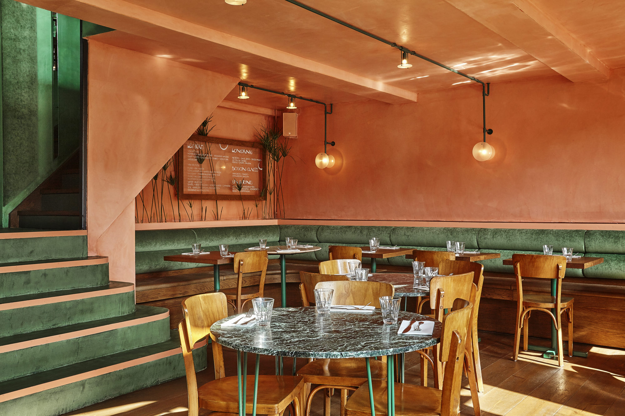
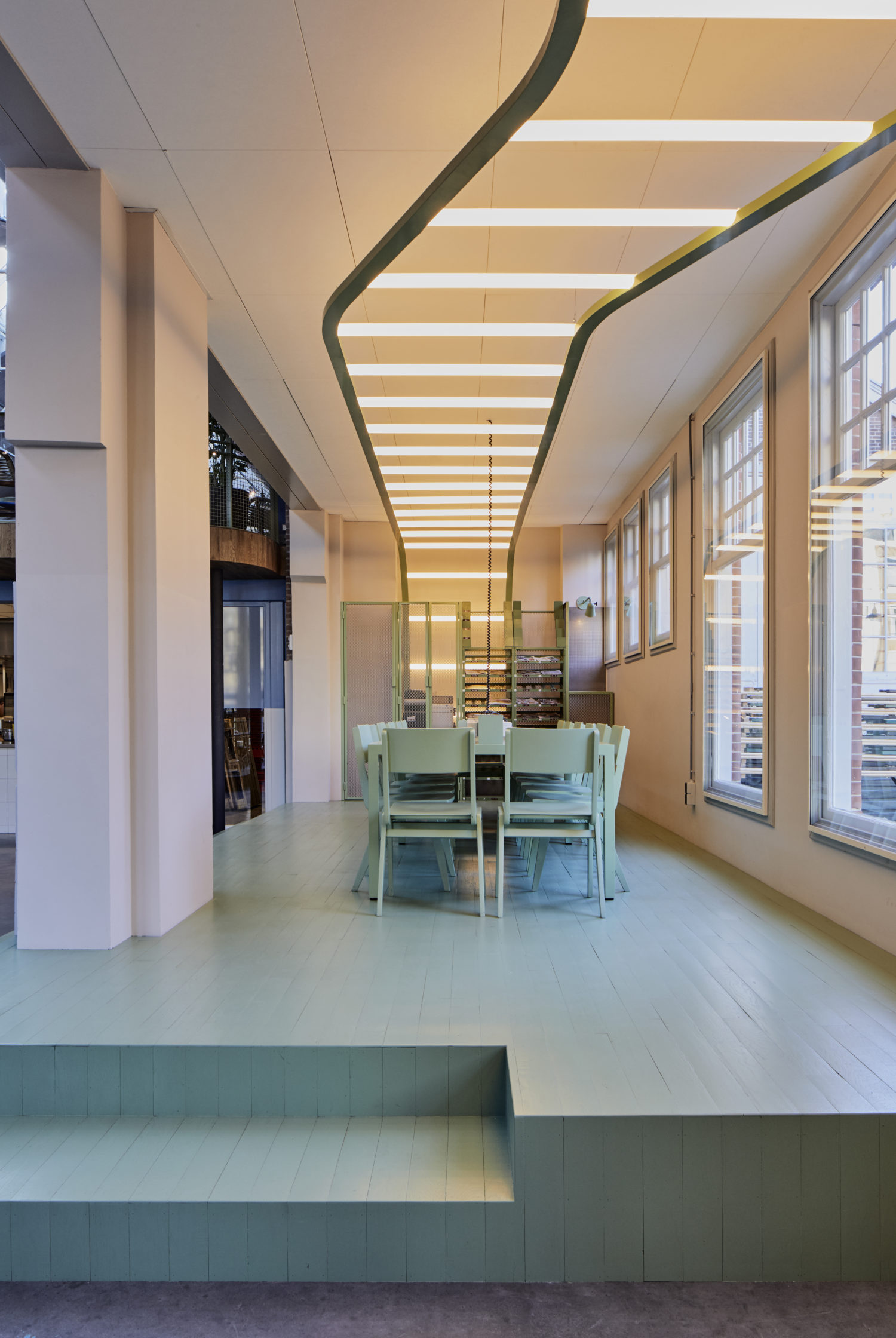
Bar Botanique, Amsterdam, Netherlands. Designed by Studio Modijefsky.
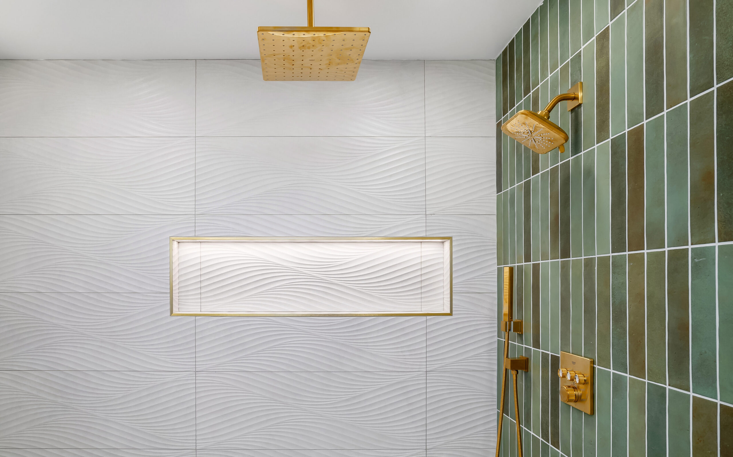
Why Color Matters in Your Home
For interior designers, color plays multiple functions in a space. “Colors can evoke memories, and can refer to certain places or moments in time,” says Esther Stam, founder of Studio Modijefsky in Amsterdam. “A lavender blue can remind you of France, but a special type of green can be historical — like we have a city here close to Amsterdam called Zaandam and zaans groen is the green famous there. And colors can come from materials or ingredients that are locally available or used for making colors — colors that are related to a geographical context.”
Color can also serve as a tool to convey your personal history, according to Bryan Mason, co-founder of AphroChic in Brooklyn.
“When you’re able to incorporate your history, you’re able to blend those elements seamlessly into a space without it being dramatic or costume-y,” Mason says. “People connect to that space — color is very emotional when you get that combination right. People will settle into that space in a way they weren’t before.”
Kanarie Club, Amsterdam, Netherlands. Designed by Studio Modijefsky
Playing with Color
Stam says the same colors can feel completely different when combined with other tones. “A red is different with a light blue next to it or a green next to it, and some combinations cultivate specific memories. A color combined with another one can elevate it to something new. This is why I never get tired of a specific color — it can be something totally different in another composition.”
According to AphroChic co-founder Jeanine Hays, color should be “a fun process, and it can be very playful. When we’re kids, we play with color all the time—our Crayola box with a hundred crayons. And it can be a really fun project for adults.”
Patrick Cline, design by AphroChic
How to Bring Color into Your Space
Here are tips for using color in your home or apartment:
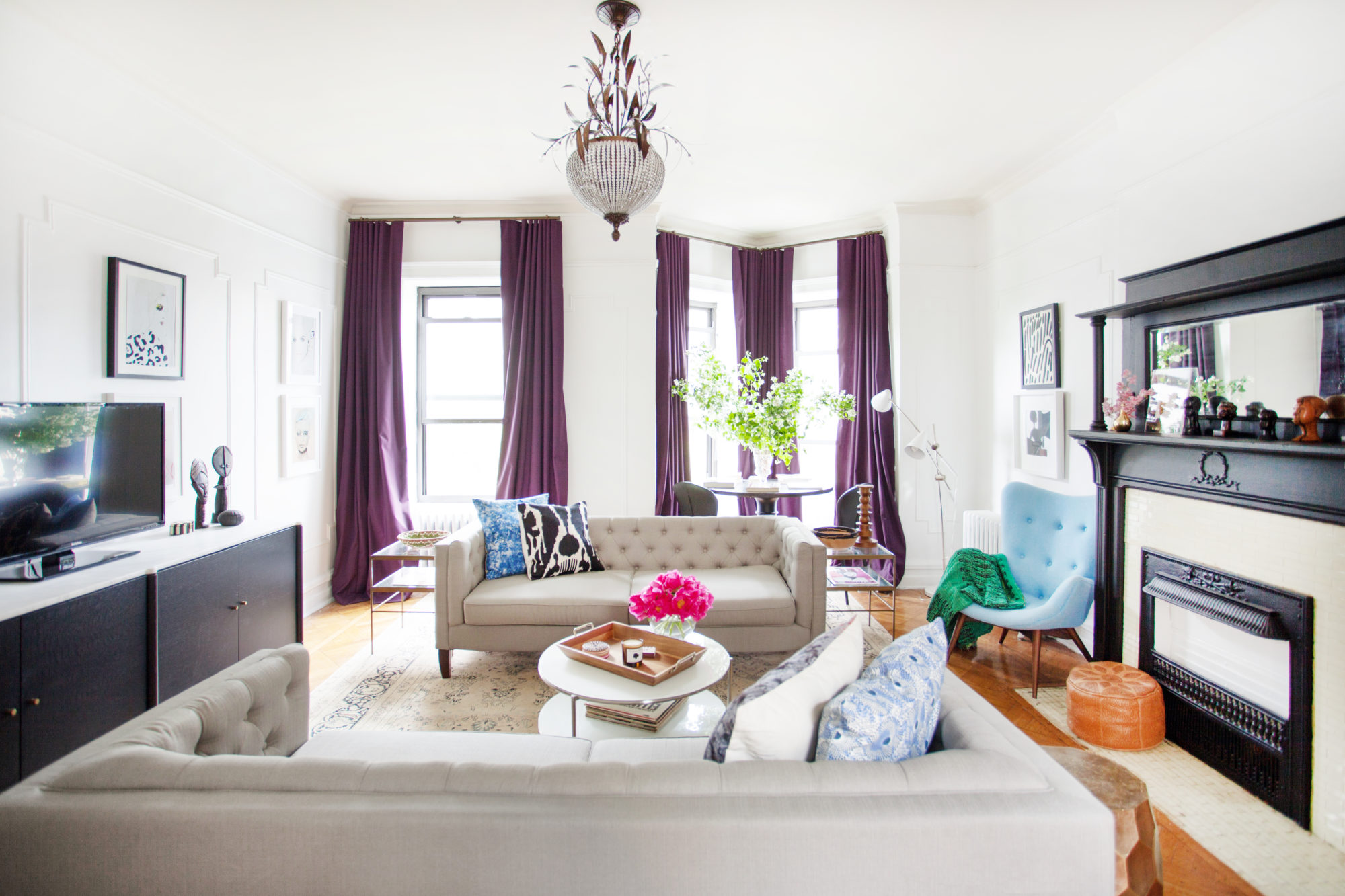
Start Small: Use accessories to bring in color, especially more daring shades. “In our living room,” says Hays, “we have really dark purple drapes, and when people come in the drapery really catches their attention, because it brings a touch of color and warmth into the space immediately.”
Don’t Be Afraid: Take a chance with color. “With the economic crisis, I think people were playing it safe,” Stam says. “There is a bit more freedom now. It’s another era—more space for outspoken, celebrating, daring things.”
Color All Over: Don’t just paint one wall in a color, but try a more holistic approach that incorporates the walls, molding and ceiling. “It’s a great way to be enveloped in color without contrast happening, where the ceiling is white,” Hays says. “Treat it just as you would treat white on a wall. It becomes really cozy and comfortable.”
Add Texture: Play with the relations between colors, materials and textures. “The way a color is used can determine the ambiance it will create,” Stam says. “A red can be used as a velvet, a marble or a high gloss paint. You could say the color of wood is brown, but if you use a brown paint it’s a totally different thing. So colors can be introduced by materials as well.”
Bring Color Through Art: If you’re not ready to commit to a color on your walls or have to keep them neutral because it’s a rental, start with the art. “Bringing in art that really appeals to you could be a wonderful starting point,” Hays says. “That can also be the start of your color palette within your space as well. You can bring it through with a throw pillow or a blanket or through some other decorative elements.”